


Brand Identity — Apparel & Visual System
Adrenaline Junkie isn’t subtle. It’s movement. Impact. Noise.
Adrenaline Junkie brand identity explores the visual language of extreme sports culture. The project focuses on bold typography, energetic graphics, and a flexible system designed for apparel, merchandise, and promotional campaigns.
The goal was simple: create a brand identity that feels fast, fearless, and unmistakable. At the same time, the design needed to work across clothing, digital media, and large-scale graphics.
Visual Language & Typography
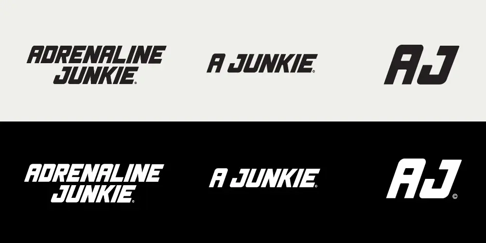
As a UX/UI graphic designer in Los Angeles, I approach brand systems with the same principle — clarity first, then force. The identity centers on momentum: a charging rhino as the core mark, aggressive but controlled. It’s paired with a heavy italic typeface that references vintage muscle and speed — mechanical, fast, unapologetic.
Design Approach
The intention wasn’t decoration. Instead, the goal was to build a brand presence that communicates energy instantly — before a single word is read.