Adrenaline Junkie brand identity is a Los Angeles apparel branding project built to capture speed, force, and fearless visual energy. Designed for streetwear, merchandise, and digital campaigns, this identity system combines bold typography, motion-driven graphics, and a high-impact logo mark created to perform across apparel and promotional media.
Brand Identity for Motion & Impact
Adrenaline Junkie brand identity was created to capture speed, movement, and fearless streetwear energy through bold typography, high-contrast visuals, and apparel-first branding.
The goal was to shape a brand that communicates force instantly while remaining adaptable across clothing, promotional campaigns, and digital media.
Visual Language, Typography & Apparel System
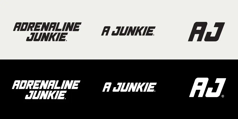
The identity centers on momentum: a charging rhino as the core mark, aggressive yet controlled. It’s paired with a heavy italic typeface that references speed, mechanical precision, and vintage motorsport energy without leaning into cliché.
Designed as an apparel-first system, every element was considered for hoodies, tees, merchandise graphics, and large-scale brand applications, allowing the visual language to remain bold and recognizable at every size.
Designed to Hold Energy at Scale
From logo construction to digital mockups, the system was developed to retain clarity and impact across apparel, web, and social media. Sharp angles, compressed forms, and a forward visual rhythm create a sense of acceleration—even at rest.
Rather than relying on excess, the work uses form, contrast, and directional movement to make the brand feel immediate, athletic, and built for high-adrenaline culture.